Enhancing brand identity with custom illustrations
Inside this article:
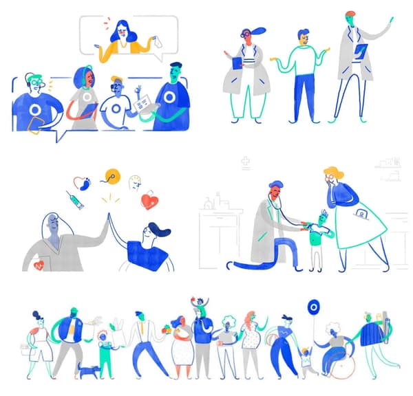
If you haven’t been living under a rock for the last year, you probably already noticed the increased appearance of illustrations in digital products. Illustration has made its way into product design in a big way and shows no signs of slowing down. Custom imagery is nowadays a crucial element of digital products. Why? Using illustrations in your app or website will make it easier to understand, more trustworthy and engaging, topping it all up with an overall pleasant experience. Illustrations can tell a story and convey a distinct personality. Custom illustrations can be especially impactful. They can make your audience feel personally connected to your digital product while adding value to brand’s concept and mission.
What happened to stock imagery?
In print, custom illustration has always played a major role but when you think of digital media it has never been too popular. Its place was taken by cheap stock photography. The accessibility of stock left imagery underutilized in digital products.
Stock photography is often forgettable, boring, and bland. To find the image that will match your brand and sell your product you need to go through thousands of stock photos looking at ridiculously happy people in silly poses. Unless you have a budget to hire a professional photographer (and usually models) you are stuck with stock galleries. Although real photography is great it is also limited. Being consistent with the brand might be harder to execute and metaphorical meaning is not that easy to convey. Most web products cannot even be represented by photos e.g. how to show cloud solutions?

The power of illustrations in product design
This is where custom imagery comes into play. Illustration in product design can be of great assistance going far beyond the limitations of photography (not to mention stock photos). Developing custom illustration style and imagery is not super easy either. Though the potential of this asset is like no other.
You might think that the main goal of illustration in product design is decoration but it is most definitely not. The main objective is communication. The illustration is an integral part of modern UI because of its unique ability to communicate content. Words can tell you something but an illustration can show you something and we all know that a picture is worth a thousand words.
Custom imagery works best when you need to simplify complex ideas. It is especially important in tech products where it helps users to bridge the gap between theoretical knowledge and intuitive understanding. As digital products and services are getting untouchable illustrated metaphors are becoming the most compelling tool in finding a way to articulate what is happening in a digestible and relatable way.
Illustration in product design enhances your brand identity. It gives you a chance to create a unique, memorable style that will live long in the memory of your users. Illustrations can capture and communicate feelings creating a powerful emotional connection and making online experiences feel more personal. They create a lot of opportunities to bring life, humanity and immediate warmth to a design.

Guide your user
We put well-thought images in the product to show the user that we’ve got his back and we’re always there to guide him through the digital experience. Illustration in product sets out to be successful in making this experience smooth and informative. It explains the current situation, provides a wider context, adds clarity, or leads the user to the next action.
For empty and zero states illustration is there to tell the user there is currently nothing going on there, guide him what to do next and promise the future state. Something brakes in your app (and don’t say never, cause let’s be honest, it happens to all of us)? Reassure your user it’s neither their fault nor a serious matter. Let him take ownership of that failure by explaining what happened and navigating back to the track.

On-boarding screens are driven mainly by illustrations as they can so quickly tell a story behind the product or a new feature. When you create an engaging and interactive walkthrough filled with meaningful illustrations it will surely profit in a quick explanation and better understanding of the features you’re trying to introduce. And eventually by invoking the user’s interest in the app at the initial step itself aids better conversion.
Another common reason to use illustrations is to show the user his progress and reward for the efforts. Any kind of accomplishments like account setup completion, new feature usage, placing a reservation can be represented with artwork giving a user a positive experience that will give him the confidence to use it more and more.
You cannot replace content strategists with illustrators but you can definitely boost the usability of your product by minimizing the copy with an additional illo here and there. There is no need to use paragraphs of words that nobody reads if you can support this information using visuals.

The mascot effect
Nowadays, we try and use a lot of products on a regular basis, but only a few of them create a truly memorable experience and we stick to them.
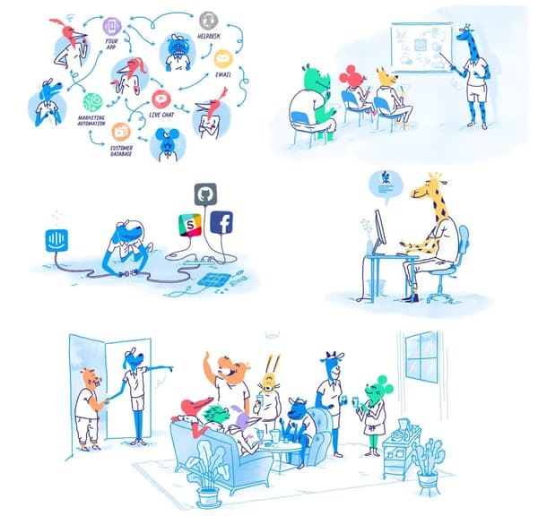
The use of a fictional brand mascot in a user interface is a popular marketing strategy to personify the brand. A good mascot is an icon we strongly identify with a certain product. They become a metaphorical face of the brand and with that symbolic nature, they create a more memorable experience. These mascots can come in hand when you’re trying to communicate on a personal level, breathing in life into the product. They work as an interconnector between the interface and the user. It is especially crucial for web-based brands that have no tangible product or service that exist in the real world, here a unique mascot gives users something concrete to connect to. As any other illustration, your mascot should be used thoughtfully to enhance the experience. It should help the user rather than distract them.

Afterwords
Custom artwork and illustration helps create a visual language that can make your product easier to understand and more engaging with an overall heartwarming look but there’s a catch. Just as illustration gains popularity in product world, our understanding of how and when to use it strategically falls way behind. If you are unaware of the theory and techniques behind product strategy and illustration your efforts might harm your product. In the following weeks, I’ll share with you my thoughts on how to develop an illustration style that works based on the work we did at Nexocode.


