Developing a consistent & powerful illustration style
Inside this article:
Illustrations have become a core component of digital products. Undoubtedly they are not only needed but wanted. Still, this is not a material that you can just produce anyway you like and throw here and there in the app to make it beautiful. They have to follow a particular style, and there has to be a process behind it. You may think that it is a magical and whimsical process happening behind closed doors, that involves designers falling into a deep meditative state until sparks of creativity burst out of their pencils. In fact, it is something entirely opposite (or at least should be), it is a well-defined process one should follow to create an illustrative style that works. When illustrations are built according to the style, they provide a more natural and harmonic feeling of the product and brand in general. And for that to happen, your brand illustrations should feel consistent, like they came from the same source even if they were created by different people. So, how to kick-off your next illustration identity project?
It is all about the message
We use illustration across the product to support a cohesive, easy to understand, and consistent story from start to finish. Therefore, you need to start your work at the very base of the traits represented by the brand. Think about the brand values, value proposition and the market you’re targeting. These artifacts will help you direct the tone of the illustrations. It is crucial to define the goal of your illustration identity project and to specify what are the priorities for it. Another review you should direct is checking the competitor market. Survey what your competitors are doing and how can you stand out with your brand. All of this is not really drawing… But, creating an audit like this will be the base of all the creative steps you will be taking after and should take into account when doing the actual creative work.
Create your mood board and explore
Assembling visual influences can combat the creative roadblock familiar at the start of new design endeavors. Kick-start your creative process with this visual brainstorming method. Collect examples that resonate with your brand and whatever you feel that inspires you and sets the direction. Scour the Internet. Whether physically collaged or digitally collected in your favorite tool, mood boards will help you gather and organize inspiration around the style. It is a valuable and easy to create resource that will not only be of use to you and your design team but also an asset that you can share with your stakeholders. Mood boards provide a tangible representation of design direction to non-designers, visually supporting concepts.
A carefully created mood board is a great way to refine the style before diving into the actual design process. Assembling a mood board is fast, easy, inexpensive, and collaborative. This is the low investment you should make to see if the chosen direction will convey the right message and match the overall brand style.
Explore more & more to create your visual style
Once you get the ball rolling, go ahead and explore more. Start copying the selected inspirations and styles for exploratory purposes. Steal like an artist and see where will it get you. Remember that the path you choose has to be the path you follow. Consistent design is intuitive design. Continual use of your chosen color palettes and shapes enables people to switch context across modules of your product with a higher degree of confidence. This is why developing a unique illustration style is so important. So make sure that the form is flexible enough to use in different mediums and cases and that you as an illustrator feel comfortable working with it. Ask yourself if you will be happy and comfortable drawing that way? Or whether you will be proud of the work you make? Your goal is to develop a signature style that can be followed.
Decide on the color palette and how should it be used
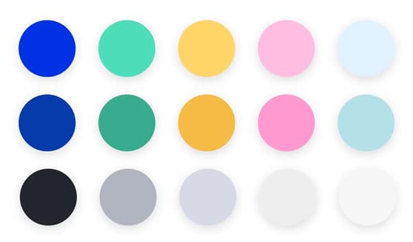
Colors you will use in your illustrations have to resonate with the brand as they are said to carry the most significant part of brand consistency. Though it doesn’t mean you need to strictly stick to the colors your product uses. In many cases, the key recognizable brand colors are too dominant to be used as the only ones for illustrations. You might want to balance the colors with a bigger palette of lighter shades and more neutral tones that will complement the signature brand colors. These additional shades of color will help you to create volume and clarity in your illustrations where the primary palette falls short.

Breathe some life into your product with custom characters
By injecting some personality into your brand, you are given an opportunity to differentiate yourself in a super crowded landscape of online services and products. Introducing characters into your brand artwork gives you a chance to reinforce the fun, playful approach. Custom characters contribute much to the voice and tone of the brand and can even become a metaphorical face of a product. Putting the character into various scenes enables you to explain multiple difficult scenarios through illustration rather than wordy content. Again, you should start your work on a role by thinking of the traits you want your character to convey. Once you’re ready with your characters, try to create a quick guide on how the characters should be constructed. Some of the guidelines you may want to include are, e.g., body proportions that should be followed, drawing faces and emotions, clothing, and other body details. Character illustration is a task where you should also think of diversity and inclusion. So take a minute to specify a set of rules on how your illustration style can represent a variety of body shapes, genders or races. To understand the issue better, I advise you to read these great articles from Meg Robichaud, Alice Lee and Jennifer Hom.

Hero & spot illustrations
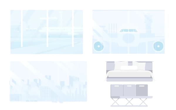
In your work, you should take a substantial amount of time to work on theme illustrations. Hero or theme illustrations are usually used on landing pages and make the majority of the screen space available. You should leverage hero illustrations with strong visual metaphors to establish an emotional appeal from the first seconds of user interaction. When you look at this kind of drawings from respected and popular brands that focus on design, you’ll find that they are becoming more and more complex, sophisticated, stylish, and metaphorical, moving these brands to the next level. Go ahead and try to create your own scenes that complement your brand style imbuing abstract concepts with approachability and can be used as the key element on a landing page or as a spot supportive imagery. Try using the characters you created putting them into various scenes that explain different difficult scenarios through illustration rather than wordy content. Admittedly, it can be done later, but treat this part as an exploratory exercise where you can spread your wings and work without too many restrictions. There is no need to create illustrations that will fill up all the space available in your product. This is more of a trial and error work where you can show the feelings and the overall looks of the illustration in action. Take my word that this is the part your inner creative creature will probably enjoy the most!


Readymade elements for aid
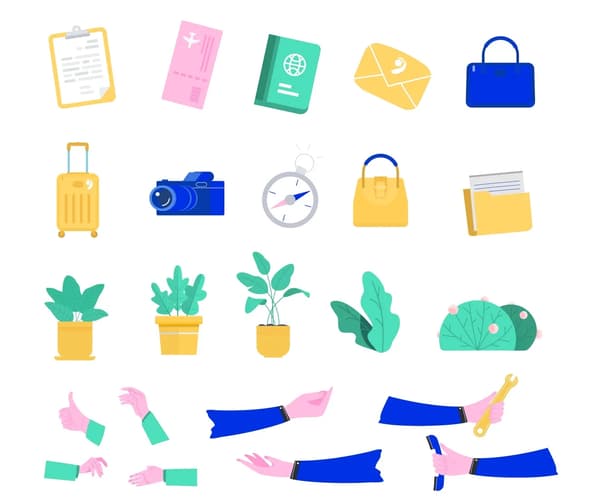
Assets you create for your library give you the flexibility to expand on the illustrative approach across your brand. It is a really great idea to invest some time at the beginning of your project (and also later on) and create your own construction kit. A design kit that consists of small secondary objects or scenery sets is a starting point for quickly putting together product illustrations. The design construction kit is useful for designers and other stakeholders who can quickly put together illustrations and narrative that they need. This is a time and money saver that helps to keep the look and feel consistent. As you move forward, search for other areas and use cases where you could push the catalog of your assets even further with, for instance, smaller icons. Basically, the more assets you have in your illustrative library, the more flexibility you have to utilize the illustrative approach across the whole product.


Combine it all in a go-to document
Now you have a bunch of illustrations and a concise set of rules to construct them. The next step is to create complete documentation that showcases all visual elements and the strategy one needs to follow when creating new ones. Once ready, the illustration system doc can be shared between product stakeholders, marketing teams and of course the design team to make sure all future artwork created aligns with the style guide. You need to build this base so that the next person to step in can quickly get up to speed. Keep in mind, that most probably this will be a living document that will need to updated as brand illustration style matures and evolves.
There is one more point that is worth noting here. Do not sit down to your documentation at the end of the style creation process. Try to fill it in as you move down the creative path, describing and explaining your decisions. Writing things down will make you rethink them and will keep your style guide cohesive and comprehensive.
So what’s next?
Keep on going with what you started and evolve the style. Try to implement it in all other areas like marketing or the general communication and make sure it has found a voice and appropriate tone for your brand. Make sure that all the materials are covered, complimenting the product facilitating a cohesive, remarkable and empowering user experience.


